Dreamwidth for mobile browsing
Apr. 15th, 2022 12:56 pmI've made this guide to browsing and using dreamwidth on a mobile device.
(If you're like: "I already know about the problem, take me to the solutions!")
One of the things Dreamwidth was designed to provide, in the tradition of its predecessor, livejournal, was a customized look and feel. People delighted in skinning and redesigning not only their own journals, but also the look and feel of their readings lists, or even all the pages they interacted with.
Of course, this meant you could make your page pretty much unreadable by making the font tiny, or the same colour as their background, or set the text direction right to left, or any one of a million very bad design decisions which web 3.0 has thoughtfully taken out of the hands of users. Naturally, hacks to overcome this were also developed.
Dreamwidth was also designed for desktop users, and obviously, many things, including writing long posts, are easier with a desktop, but browsing social media on the bus is not one of them. In the modern era, many people get a lot of their internet on mobile. Sometimes, dreamwidth does not look great on mobile! Although some of these hacks predate mobile internet, and were designed to let you read someone's drarry fic that was written in 7 pt font in pale green, they can still help you!
(I'm providing some sample views of layouts under different conditions, but they are pretty small images since I think the point is made even when the text is too small to read. However, if you click through you can see them at slightly higher resolution.)
Here's my dw on desktop:

It's fine.
Here's my dw on my phone, it may look slightly different on yours.

Even though it's not the worst, it's still sub-par. Most of the viewport is taken up with big banners that don't convey much and you have to scroll down to get to the content. If you scroll down, the content is made somewhat narrow by the margins.

My dw is actually more legible than some, because I have not been very creative in customizing it, though. Here is![[personal profile]](https://www.dreamwidth.org/img/silk/identity/user.png) newredshoes/
newredshoes/![[twitter.com profile]](https://p.dreamwidth.org/e0caa790ec10/-/twitter.com/favicon.ico) niedaddy
niedaddy

Note that the posts are on the left
Here is the same page viewed on my phone

Note that the main content, the posts, has been squished down to a little ribbon on the left that is about 15% of the view.
(Depending on what link you followed to read this tutorial, you might already be reading the format=light version! Check the url to see!)
If you don't want to do anything that involves having/creating an account, there is one very simple hack that will render nearly any given page readable on almost any device. (Contrariwise, if you have an account, there is a simpler way to set this up that it will do this for you automatically on every page, instead of you having to click it. Skip to the next section.)
On some, but not all pages, you will see a thing at the top that looks like this (although it may vary slightly, including not having my profile at the top):

Specifically the part that says "reload page in style: light"

Yes! Follow that link!
It will reload the page with almost all the formatting stripped away. In this case, you will get:

But wait, you said some, not all?
First, let me give you the briefest possible tutorial to url parameters.
maybe you have seen some urls that look like this?
Everything between the ? and the # is like the "special instructions" box on the form where you order your pizza, into which you type "please send your cutest delivery boy" and it tells the webserver anything special it needs to know about how it should send you the web-page. ? tells it an instruction is coming. The parts on the left and right of the = tell it what kind of instruction, and the content of that instruction.
The magic phrase you want is
If there is already a ?, you probably want to add your instructions, so instead of ?, you put an &, which means "Oh, and another thing!" You need to put after the ?x=y, but before any #. If there's no #, it's fine to put it at the end.
In the bygone era of lj, we all got very good at typing &format=light whenever we encountered a particularly heinous layout.
violsva kindly confirmed that all of these options work even on a free account, so if you do not already have an account, and wish to take advantage of them, you can create a free account.
Assuming, hereafter, that you have an account, first off, you can use mobile.dreamwidth.org, which provides a stripped down version of site navigation, and adds format=light to all your links! However, this is a bit too stripped down, for my liking, and also it may not work if you just click on a random link that takes you to dreamwidth. But I'm adding this in case you find it useful.
If you want dreamwidth to reformat the site for you, no matter where you go:
Go to My Account Settings: Display
Here is what it looks like, more or less, on my phone: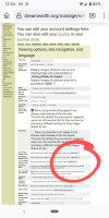
The section you want, circled in red, starts with "Entry Pages Shown To You."
You want to select "Light Format" for this option, and the next two, "Icon Pages Shown to You" and "Journal Pages shown to You." (Actually, you ...probably don't need to worry about icon pages, but click it anyway while you're here! It might be useful at some point!)
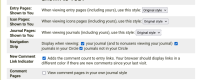
If you tick the first box in the the next section "Navigation Strip", logged out users, or those without an account who view your dw will get the little "reload the page in style: light" link at the top of all of your pages as well.
Then, scroll all the way to the bottom of the page, and change your site skin:

I use celerity, which I think of as a sort of no fuss skin, but the absolute simplest for mobile is the bottom one, lynx.
Then hit save!
Now navigate around and see if dw has become nicer for you.
You may not want to use all the options I have mentioned here, feel free to fiddle with them, you really can't break dw or your navigation by selecting or deselecting any of these.
azurelunatic in a comment to this entry describes two methods of getting a posting interface that works better on mobile.
I will edit this page, a neat thing you can do on dw, with corrections and answers to any questions.
The problem
(If you're like: "I already know about the problem, take me to the solutions!")
One of the things Dreamwidth was designed to provide, in the tradition of its predecessor, livejournal, was a customized look and feel. People delighted in skinning and redesigning not only their own journals, but also the look and feel of their readings lists, or even all the pages they interacted with.
Of course, this meant you could make your page pretty much unreadable by making the font tiny, or the same colour as their background, or set the text direction right to left, or any one of a million very bad design decisions which web 3.0 has thoughtfully taken out of the hands of users. Naturally, hacks to overcome this were also developed.
Dreamwidth was also designed for desktop users, and obviously, many things, including writing long posts, are easier with a desktop, but browsing social media on the bus is not one of them. In the modern era, many people get a lot of their internet on mobile. Sometimes, dreamwidth does not look great on mobile! Although some of these hacks predate mobile internet, and were designed to let you read someone's drarry fic that was written in 7 pt font in pale green, they can still help you!
(I'm providing some sample views of layouts under different conditions, but they are pretty small images since I think the point is made even when the text is too small to read. However, if you click through you can see them at slightly higher resolution.)
Here's my dw on desktop:

It's fine.
Here's my dw on my phone, it may look slightly different on yours.

Even though it's not the worst, it's still sub-par. Most of the viewport is taken up with big banners that don't convey much and you have to scroll down to get to the content. If you scroll down, the content is made somewhat narrow by the margins.

My dw is actually more legible than some, because I have not been very creative in customizing it, though. Here is

Note that the posts are on the left
Here is the same page viewed on my phone

Note that the main content, the posts, has been squished down to a little ribbon on the left that is about 15% of the view.
The Solutions
format=light
(Depending on what link you followed to read this tutorial, you might already be reading the format=light version! Check the url to see!)
If you don't want to do anything that involves having/creating an account, there is one very simple hack that will render nearly any given page readable on almost any device. (Contrariwise, if you have an account, there is a simpler way to set this up that it will do this for you automatically on every page, instead of you having to click it. Skip to the next section.)
On some, but not all pages, you will see a thing at the top that looks like this (although it may vary slightly, including not having my profile at the top):

Specifically the part that says "reload page in style: light"

Yes! Follow that link!
It will reload the page with almost all the formatting stripped away. In this case, you will get:

But wait, you said some, not all?
a small nerdy digression
First, let me give you the briefest possible tutorial to url parameters.
maybe you have seen some urls that look like this?
https://brownbetty.dreamwidth.org/687753.html?x=y#commentsEverything between the ? and the # is like the "special instructions" box on the form where you order your pizza, into which you type "please send your cutest delivery boy" and it tells the webserver anything special it needs to know about how it should send you the web-page. ? tells it an instruction is coming. The parts on the left and right of the = tell it what kind of instruction, and the content of that instruction.
The magic phrase you want is
?format=lightIf there is already a ?, you probably want to add your instructions, so instead of ?, you put an &, which means "Oh, and another thing!" You need to put after the ?x=y, but before any #. If there's no #, it's fine to put it at the end.
In the bygone era of lj, we all got very good at typing &format=light whenever we encountered a particularly heinous layout.
If you have an account, or if you are willing to create one:
Assuming, hereafter, that you have an account, first off, you can use mobile.dreamwidth.org, which provides a stripped down version of site navigation, and adds format=light to all your links! However, this is a bit too stripped down, for my liking, and also it may not work if you just click on a random link that takes you to dreamwidth. But I'm adding this in case you find it useful.
If you want dreamwidth to reformat the site for you, no matter where you go:
Change settings
Go to My Account Settings: Display
Here is what it looks like, more or less, on my phone:

The section you want, circled in red, starts with "Entry Pages Shown To You."
You want to select "Light Format" for this option, and the next two, "Icon Pages Shown to You" and "Journal Pages shown to You." (Actually, you ...probably don't need to worry about icon pages, but click it anyway while you're here! It might be useful at some point!)

If you tick the first box in the the next section "Navigation Strip", logged out users, or those without an account who view your dw will get the little "reload the page in style: light" link at the top of all of your pages as well.
Then, scroll all the way to the bottom of the page, and change your site skin:

I use celerity, which I think of as a sort of no fuss skin, but the absolute simplest for mobile is the bottom one, lynx.
Then hit save!
Now navigate around and see if dw has become nicer for you.
You may not want to use all the options I have mentioned here, feel free to fiddle with them, you really can't break dw or your navigation by selecting or deselecting any of these.
Posting tho!
I will edit this page, a neat thing you can do on dw, with corrections and answers to any questions.
no subject
Date: 2022-04-15 08:35 pm (UTC)no subject
Date: 2022-04-15 08:37 pm (UTC)no subject
Date: 2022-04-15 08:55 pm (UTC)Cool! I think this may be for a more web 2.0 demographic than this post is aimed at. I mean, I don't think people who are worried elon musk may buy twitter are ready to learn about the console.
no subject
Date: 2022-04-15 09:02 pm (UTC)no subject
Date: 2022-04-15 09:33 pm (UTC)I'm guessing that most of the people on dreamwidth already have a way of using dreamwidth that works for them. But maybe not!